
An argument for visible functions, logical structures and software that helps people work instead of sending them on a treasure hunt.
Here I am again, sitting in front of a piece of software, looking for a function that I know exists.
I search. And search. And search.
Eventually, I ask an AI assistant for help. It politely tells me to click a particular icon. I look at the screen, only to discover that I cannot even find the icon it is referring to.
Welcome to the wonderful world of modern software design.
I find this increasingly frustrating. Not because today’s applications lack functionality. Quite the opposite: many are extraordinarily capable. The problem is that their capabilities are becoming progressively harder to discover.
The interface looks clean. Everything appears simple. Yet finding what you need can feel unnecessarily complicated.
That is not progress. It is a step backwards in usability.
When Software Had a Visible Structure
Traditional desktop applications often followed a recognisable structure: File, Edit, View, Tools, Window and Help.
These menus were hardly glamorous. Some applications were cluttered, and not every design decision was sensible. But there was one considerable advantage: you could explore the software systematically.
You could open a menu, see what was available and gradually understand how the application worked.
A well-organised menu was effectively a map of the software.
Today, we are increasingly presented with three dots, a hamburger menu, a gear icon and a collection of symbols whose meaning is not always obvious.
Behind these innocent-looking icons may be dozens of functions. Even experienced users can find themselves searching for familiar features after yet another redesign.
Complexity does not disappear simply because its controls are hidden. It merely becomes less visible.
This Is More Than Nostalgia
The criticism of hidden navigation is supported by usability research.
In 2016, Kara Pernice and Raluca Budiu of the Nielsen Norman Group reported that hidden navigation performed worse than visible navigation in several usability measures. Their findings included reduced discoverability and difficulties with task completion.
In the navigation patterns they tested, hiding navigation nearly halved its discoverability. This finding should not be treated as a universal statistic for every application, but it is a compelling warning against hiding important functionality without good reason.
Research: Hamburger Menus and Hidden Navigation Hurt UX Metrics – Nielsen Norman Group
Of course, defenders of minimalist interfaces have a legitimate argument.
Not every advanced option needs to remain visible all the time. Jakob Nielsen’s principle of progressive disclosure recommends showing essential features first and revealing more specialised options when necessary.
Used intelligently, this approach can help beginners and reduce unnecessary distractions.
Research: Progressive Disclosure – Nielsen Norman Group
But there is a crucial distinction between organising complexity and concealing it. An interface that makes its structure understandable is not the same as one that simply hides most of its functions.
Two Interfaces, One Application
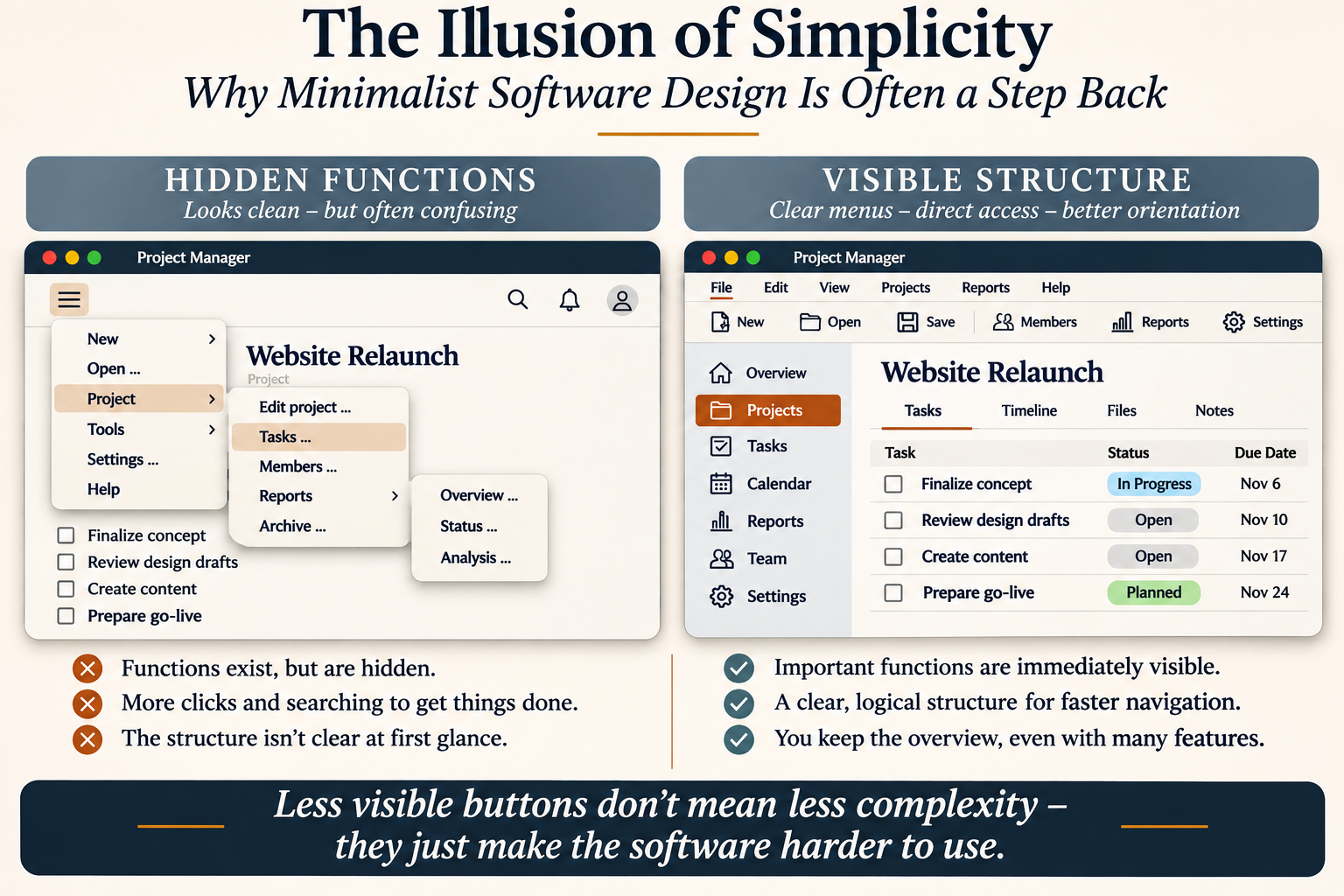
Imagine two versions of the same project management application.
Both offer project planning, task management, reporting, team administration and settings.
The first version displays only a few controls. Important functions are hidden behind several layers of menus.
The second version provides a visible menu bar, clearly labelled tools and a logical navigation structure.
Both are equally capable. But the second immediately communicates what the application can do.
Illustration: Two fictional project management interfaces demonstrating hidden functions and visible navigation. This is a conceptual comparison, not an empirical usability test.
This does not prove that traditional interfaces are always faster. Usability depends on the tasks, the users and the quality of implementation.
However, a visible structure provides something valuable before the user even begins working: orientation.
Mobile First Must Not Mean Desktop Second
Another common justification for minimalist design is the mobile-first philosophy.
Designing for smartphones makes perfect sense when people use an application on a small touchscreen. But why should that automatically determine how the same application behaves on a large desktop monitor?
Professionals working with complex documents, business processes, financial data or project plans often spend their working days at laptops and desktop computers.
They need efficient navigation, clear labels, visible tools and an overview of their work.
There is room on a desktop screen. Why not use it intelligently?
Accessibility matters, too. Tiny icons, low contrast and ambiguous controls can create additional difficulties, particularly as users grow older or their eyesight changes.
Good design should adapt to people and their tasks, rather than forcing every user into the same aesthetic philosophy.
Simplicity Is Not the Same as Emptiness
I have nothing against elegant software. I appreciate a clean, attractive interface as much as anyone.
But appearance must never become more important than usability.
When an application looks simple but requires extensive searching, the simplicity is largely an illusion.
I am not suggesting that we should return to every grey dialogue box of the 1990s. What I want is something more intelligent: clear menus, meaningful labels, consistent navigation and an understandable hierarchy of functions.
Advanced features can certainly be organised into additional menus. But essential functions and the basic structure of an application should remain readily discoverable.
The software industry needs to remember a fundamental principle:
The best interface is not necessarily the one with the fewest visible buttons. It is the one that allows people to complete their work efficiently, confidently and without unnecessary searching.
Give users their overview back.
Because good software should not merely look easy to use.
It should actually be easy to use.
Editorial note: This opinion article is associated with the end of August 2026. The opening example involving Firefox and AI assistance was added in November 2026. The cited research was published in 2006 and 2016.