
• +44 7864 861589
  • christoph@kopowski.com

Digital Transformation

The Illusion of Simplicity: Why Minimalist Software Design Is Often a Step Back

An argument for visible functions, logical structures and software that helps people work instead of sending them on a treasure hunt.

Here I am again, sitting in front of a piece of software, looking for a function that I know exists.

I search. And search. And search.

Eventually, I ask an AI assistant for help. It politely tells me to click a particular icon. I look at the screen, only to discover that I cannot even find the icon it is referring to.

Welcome to the wonderful world of modern software design.

I find this increasingly frustrating. Not because today’s applications lack functionality. Quite the opposite: many are extraordinarily capable. The problem is that their capabilities are becoming progressively harder to discover.

The interface looks clean. Everything appears simple. Yet finding what you need can feel unnecessarily complicated.

That is not progress. It is a step backwards in usability.

When Software Had a Visible Structure

Traditional desktop applications often followed a recognisable structure: File, Edit, View, Tools, Window and Help.

These menus were hardly glamorous. Some applications were cluttered, and not every design decision was sensible. But there was one considerable advantage: you could explore the software systematically.

You could open a menu, see what was available and gradually understand how the application worked.

A well-organised menu was effectively a map of the software.

Today, we are increasingly presented with three dots, a hamburger menu, a gear icon and a collection of symbols whose meaning is not always obvious.

Behind these innocent-looking icons may be dozens of functions. Even experienced users can find themselves searching for familiar features after yet another redesign.

Complexity does not disappear simply because its controls are hidden. It merely becomes less visible.

This Is More Than Nostalgia

The criticism of hidden navigation is supported by usability research.

In 2016, Kara Pernice and Raluca Budiu of the Nielsen Norman Group reported that hidden navigation performed worse than visible navigation in several usability measures. Their findings included reduced discoverability and difficulties with task completion.

In the navigation patterns they tested, hiding navigation nearly halved its discoverability. This finding should not be treated as a universal statistic for every application, but it is a compelling warning against hiding important functionality without good reason.

Research: Hamburger Menus and Hidden Navigation Hurt UX Metrics – Nielsen Norman Group

Of course, defenders of minimalist interfaces have a legitimate argument.

Not every advanced option needs to remain visible all the time. Jakob Nielsen’s principle of progressive disclosure recommends showing essential features first and revealing more specialised options when necessary.

Used intelligently, this approach can help beginners and reduce unnecessary distractions.

Research: Progressive Disclosure – Nielsen Norman Group

But there is a crucial distinction between organising complexity and concealing it. An interface that makes its structure understandable is not the same as one that simply hides most of its functions.

Two Interfaces, One Application

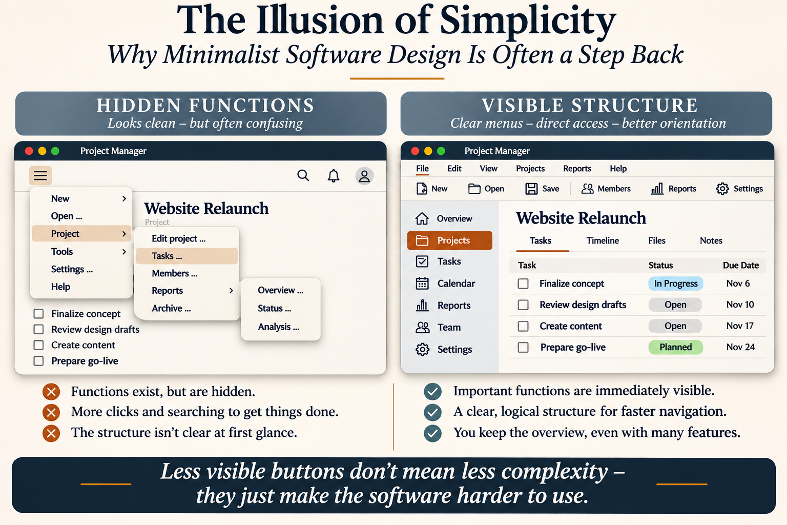
Imagine two versions of the same project management application.

Both offer project planning, task management, reporting, team administration and settings.

The first version displays only a few controls. Important functions are hidden behind several layers of menus.

The second version provides a visible menu bar, clearly labelled tools and a logical navigation structure.

Both are equally capable. But the second immediately communicates what the application can do.

Illustration: Two fictional project management interfaces demonstrating hidden functions and visible navigation. This is a conceptual comparison, not an empirical usability test.

This does not prove that traditional interfaces are always faster. Usability depends on the tasks, the users and the quality of implementation.

However, a visible structure provides something valuable before the user even begins working: orientation.

Mobile First Must Not Mean Desktop Second

Another common justification for minimalist design is the mobile-first philosophy.

Designing for smartphones makes perfect sense when people use an application on a small touchscreen. But why should that automatically determine how the same application behaves on a large desktop monitor?

Professionals working with complex documents, business processes, financial data or project plans often spend their working days at laptops and desktop computers.

They need efficient navigation, clear labels, visible tools and an overview of their work.

There is room on a desktop screen. Why not use it intelligently?

Accessibility matters, too. Tiny icons, low contrast and ambiguous controls can create additional difficulties, particularly as users grow older or their eyesight changes.

Good design should adapt to people and their tasks, rather than forcing every user into the same aesthetic philosophy.

Simplicity Is Not the Same as Emptiness

I have nothing against elegant software. I appreciate a clean, attractive interface as much as anyone.

But appearance must never become more important than usability.

When an application looks simple but requires extensive searching, the simplicity is largely an illusion.

I am not suggesting that we should return to every grey dialogue box of the 1990s. What I want is something more intelligent: clear menus, meaningful labels, consistent navigation and an understandable hierarchy of functions.

Advanced features can certainly be organised into additional menus. But essential functions and the basic structure of an application should remain readily discoverable.

The software industry needs to remember a fundamental principle:

The best interface is not necessarily the one with the fewest visible buttons. It is the one that allows people to complete their work efficiently, confidently and without unnecessary searching.

Give users their overview back.

Because good software should not merely look easy to use.

It should actually be easy to use.


Editorial note: This opinion article is associated with the end of August 2026. The opening example involving Firefox and AI assistance was added in November 2026. The cited research was published in 2006 and 2016.

Scrum = Endless Meetings?

When Scrum Becomes a Meeting Machine

Agile project management is meant to accelerate value creation, not suffocate it in the calendar.

Reading time: approximately 7 minutes

In its original form, Scrum is not a cumbersome administrative apparatus, but a lightweight framework for leadership and delivery. That is precisely where its appeal lies: clear roles, clear cadence, clear responsibilities.[1] And yet many companies experience something entirely different: the day begins with the Daily Scrum, continues with refinement, stakeholder calls, alignment sessions, steering meetings and review preparation, and ends exactly where the actual work finally begins – in the evening.

To avoid misunderstandings: agile methods can indeed lead to better results. A large quantitative study of 1,002 projects shows a positive relationship between agile working, efficiency and stakeholder satisfaction.[11] The problem, therefore, is not agility itself. The problem is poor execution.

Anyone familiar with this situation feels the problem not only organisationally, but physically. After a day full of meetings, one is mentally tired, even though one has formally “done a lot”. One was busy, but not necessarily effective. Developers typically describe productive days not as days full of interruptions, but as days on which they can move substantial tasks forward with as few context switches as possible.[4]

“Simplicity — the art of maximising the amount of work not done — is essential.”

Principles behind the Agile Manifesto[2]

When Agility Is Misunderstood

Poor Scrum is not recognised by the fact that people talk to one another. It is recognised by the fact that communication becomes a substitute for leadership, prioritisation and clean product work. Every open issue is turned into a meeting. The backlog is vague, so it is discussed live. Responsibilities are not clearly separated, so too many people sit at the table. The Product Owner effectively becomes a committee, so prioritisation is renegotiated constantly. The Daily Scrum becomes a status show for management, although in truth it is intended for the daily adaptation of work towards the Sprint Goal.[1]

A second misconception is added to this: many companies confuse agile visibility with permanent availability. Yet visibility does not arise because everyone is everywhere. Visibility arises through clear goals, good artefacts, reliable decisions and documented results. If meetings instead become the primary steering instrument, work shifts out of the product and into the calendar.

Research describes precisely this mechanism. Microsoft reports that half of all meetings take place in exactly those time windows in which many people have natural productivity peaks; at the same time, the analysis shows how strongly focus work is fragmented by a mixture of meetings, messages and notifications.[3] Developer research adds that interruptions and context switching are not marginal issues, but central factors influencing the experience of productivity.[4]

The cost of such fragmentation becomes even clearer in interruption research: people sometimes work faster under interruption, but they pay for it with more stress, higher frustration, greater time pressure and increased effort.[5] More recent research in software engineering also shows that the type and urgency of interruptions can measurably alter processing time and stress responses.[6]

Does It Always Have to Be This Way?

No. And professionally speaking, it must not be this way if Scrum is taken seriously. The Scrum Guide explicitly describes Scrum as a lightweight framework with clearly time-boxed events. These events are intended to create regularity and specifically to minimise the need for additional meetings.[1] A Daily Scrum is limited to 15 minutes. Sprint Planning, Review and Retrospective also have clear maximum durations. Scrum is therefore not designed as a meeting culture, but as a rhythm for focusing on value creation.

The Agile Manifesto, too, does not think in terms of constant haste, but of sustainable performance. Agile processes should enable a steady pace indefinitely.[2] A team that is exhausted after every Sprint is not working agilely, but on depletion.

This distinction is crucial in management. A high cadence can be useful. Constant friction is not. A sporting organism lives from exertion and recovery, not from a permanently elevated pulse. The same applies to companies.

What Good Scrum Really Looks Like

Well-led Scrum does not create more meeting time, but better decisions in less time. The first test is the target picture. If the Product Goal and Sprint Goal are unclear, alignment automatically multiplies. If they are precise, the need for discussion noticeably decreases because the team can make its own decisions within clear guardrails.[1]

The second test is team architecture. Scrum is designed for small, focused, self-managing teams; the Scrum Guide typically refers to ten or fewer people.[1] If teams become larger, more heterogeneous or are pushed into too many dependencies, the coordination effort explodes. That is not a character flaw of the team, but a design flaw of the system.

Research into large-scale agile programme work shows exactly this: as the number of teams increases, the need for coordination rises significantly. Coordination practices must therefore be deliberately tailored to the context, rather than simply adding more and more routines.[10]

The third test is the handling of interruptions. Agile work naturally involves more interaction. That is not bad in itself. Studies on agile teams show that interruptions can have both positive and negative consequences: they can enable clarity, feedback and faster information flows, but also create stress, delays, distraction and quality losses. The decisive point is therefore not to abolish interaction, but to filter it, bundle it and channel it cleanly through roles.[7]

Calm, focused movement as a symbol of discipline and clarity
Recommendation: Use the garden or walking image here as a calm visual break.

What Companies Should Change Now

Anyone who wants to keep Scrum and agile project management, but end meeting fatigue, should not frantically search for the next framework. In most cases, it is enough to execute the existing logic properly again:

  • Sharpen goals. Product Goal and Sprint Goal must be so clear that they can replace decisions instead of creating new meetings.[1]
  • Reclaim the Daily Scrum. No reporting to managers, no problem-solving marathon, no extension to 30 or 45 minutes. Fifteen minutes, focused on progress, impediments and the next working day.[1]
  • Channel stakeholder contact. Customer and business input is valuable, but should preferably enter the system through the Product Owner, the Sprint Review and well-maintained backlogs, rather than unexpectedly overrunning the team during day-to-day work.[1][7]
  • Meet only with purpose and preparation. A simple rule often works wonders: no agenda, no meeting. Good remote-tested meeting practice requires precisely this – including a clear purpose, prepared materials and documented outcomes.[9]
  • Work asynchronously where real-time interaction is not necessary. Status updates, comments, advance feedback, low-conflict decisions and review preparation often belong in documents, tickets, videos or written comments – not in a live meeting.[8]
  • Take optionality seriously. Not everyone has to sit in every meeting. Those who only need to be informed can receive minutes, a recording or an entry in a live document.[9]
  • Defend focus windows. If the best working hours are systematically occupied by meetings, agility becomes mere reactivity. Protected blocks for concentrated value creation are sensible – anchored programmatically in the calendar, not merely wished for rhetorically.[3]
  • Take the Scrum Master role seriously. A good Scrum Master does not merely administer ceremonies, but protects the team’s ability to work, keeps timeboxes intact, removes impediments and prevents process overgrowth.[1][7]

“No agenda, no attenda.”

GitLab Handbook, meeting principle[9]

My Conclusion

Agility is strong when it combines discipline with adaptability. Not every conversation is waste. Not every interruption is harmful. But a company that continually sacrifices value creation for coordination is leading its system poorly. Scrum is supposed to make complexity manageable. If it produces exhaustion instead, the problem usually lies not in Scrum, but in its convenient misinterpretation.

The good news is this: one does not have to abolish agility in order to become productive again. One has to lead it more precisely. Less ritual. More goal clarity. Less compulsory attendance. More documented decisions. Less meeting morality. More ability to work. That is what proper, transferable and economically sensible Scrum looks like.

Sources

  1. Scrum Guides: The Scrum Guide.
  2. Principles behind the Agile Manifesto and Manifesto for Agile Software Development.
  3. Microsoft WorkLab: Breaking down the infinite workday.
  4. Meyer et al.: Software Developers’ Perceptions of Productivity.
  5. Mark, Gudith, Klocke: The Cost of Interrupted Work: More Speed and Stress.
  6. Ma, Huang, Leach: Breaking the Flow: A Study of Interruptions During Software Engineering Activities.
  7. Wiesche: Interruptions in Agile Software Development Teams.
  8. GitLab Handbook: Asynchronous communication for remote work.
  9. GitLab Handbook: All-Remote Meetings.
  10. Dingsøyr, Moe, Seim: Coordinating Knowledge Work in Multiteam Programs.
  11. Serrador, Pinto: Does Agile work? A quantitative analysis of agile project success.
“`
1